Overview
Aramco Digital Marketplace is a B2B commerce platform, live at marketplace.aramcodigital.com. At EPAM Systems, I was one of two designers on the product in a Scrum team. We split work by area and collaborated where components overlapped.
The Product Owner's user stories defined new features and fixes; we turned them into Figma designs, refined them in daily syncs, and took final direction from the Product Owner and Project Manager. I also handed designs off to the front-end developers and checked the built UI against them.
A New Way to Compare Devices
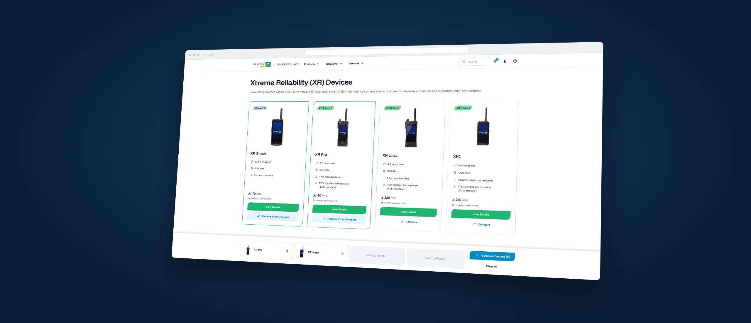
The marketplace offered four Extreme Reliability (XR) devices, and stakeholders wanted customers to be able to compare them. Neither the interaction nor a comparison page existed.
I restructured the device cards to fit a Compare action. Once selected, the button changes to Remove From Compare, and a comparison bar I designed appears at the bottom of the page with the chosen devices (its empty slots were shared work). Its Compare Devices (X) button counts the selection and becomes active at two devices.
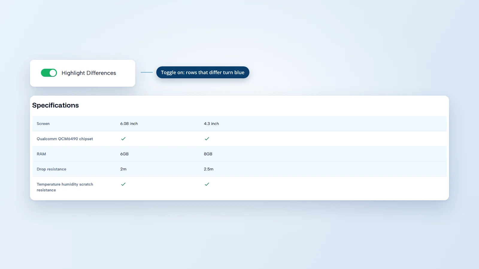
On the comparison page I designed, selected devices sit at the top with their specifications grouped below. Add Device fills an empty slot, Change swaps a device, and a Highlight Differences toggle makes the specifications easier to scan. The aim was to let customers compare devices without jumping between product pages.
Components the Product Is Built From
The team built a design system of more than 35 reusable components, designed in Figma with Material UI (MUI) as the reference rather than taken as-is. My parts of it:
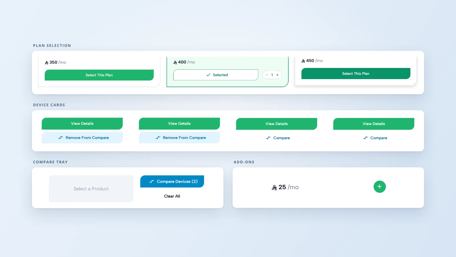
- Buttons: the Standard Button and the Irregular Button (the brand's distinctive shape), in three sizes, with default, hover, selected, focused and disabled states and stroked variants. Color styles, the Circle Button and the Icon Button were shared work.
- Cards: Product, Plan/Service, Accessory and Add-on cards.
- Smaller pieces: price labels with period variants such as /mo and /MB, Breadcrumb and the Category Page Hero Section.
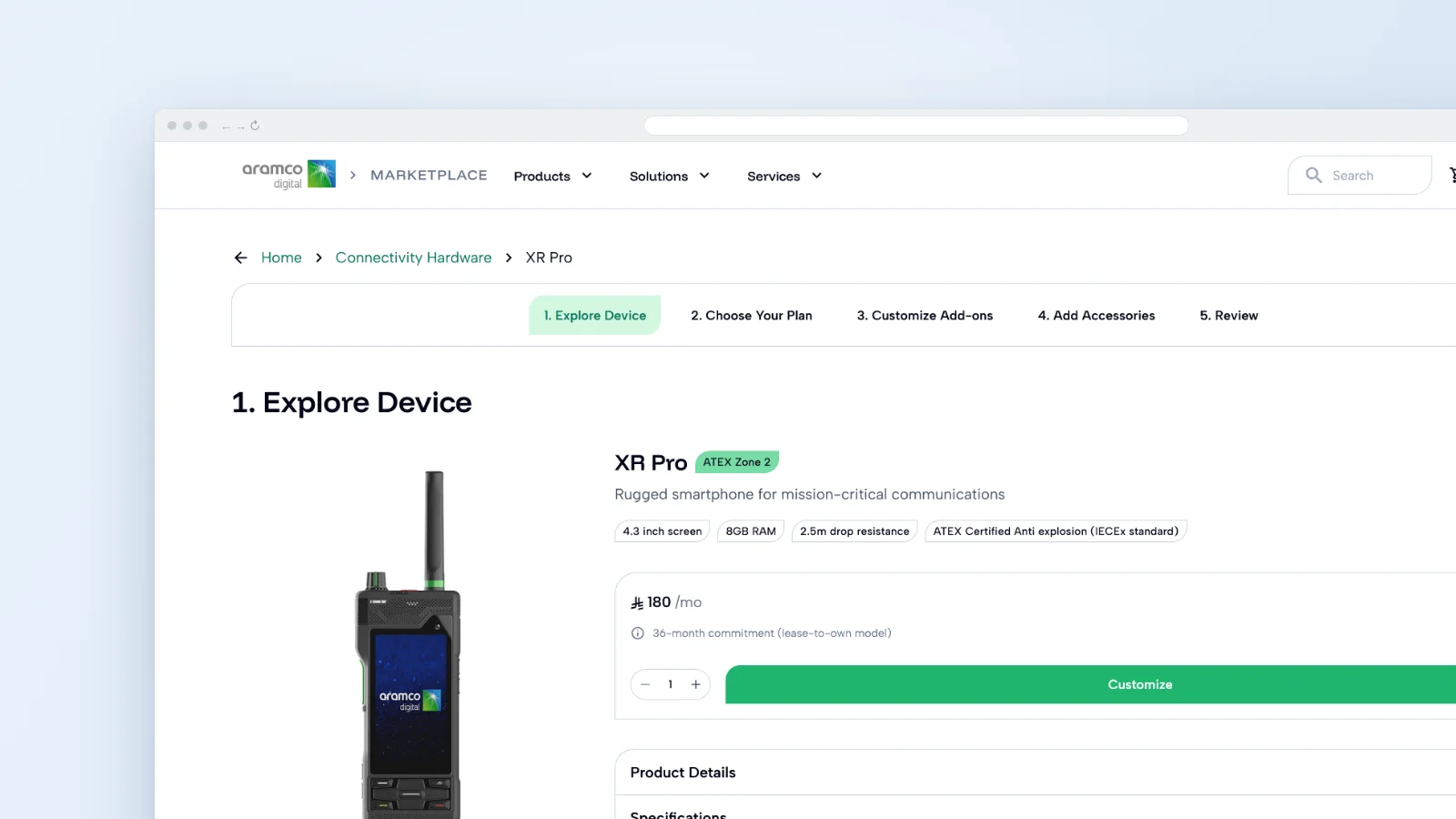
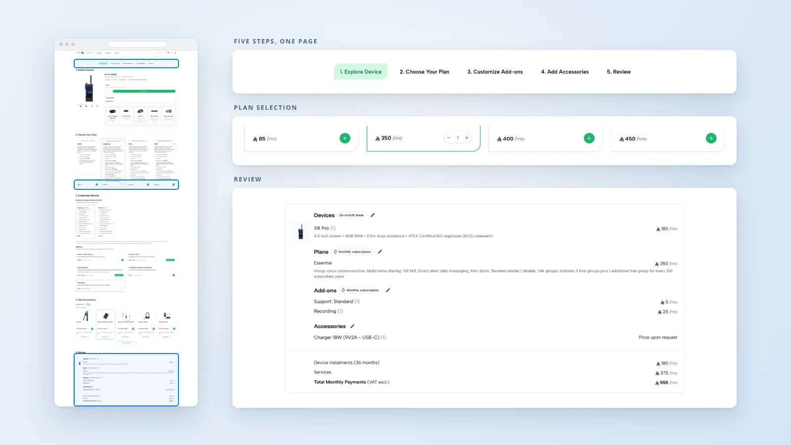
- Product detail page sections: reusable sections built on Figma content slots, so Explore, Choose, Customize Add-ons, Add Accessories and Review Order could share one structure while showing different content.
- Purchase components: purchase-flow components and the In-cart Summary Bar. I didn't design the whole cart.
Navigation, layout, the footer and the add-on and accessory selection screens were shared with my fellow designer.
Two Ways to Buy
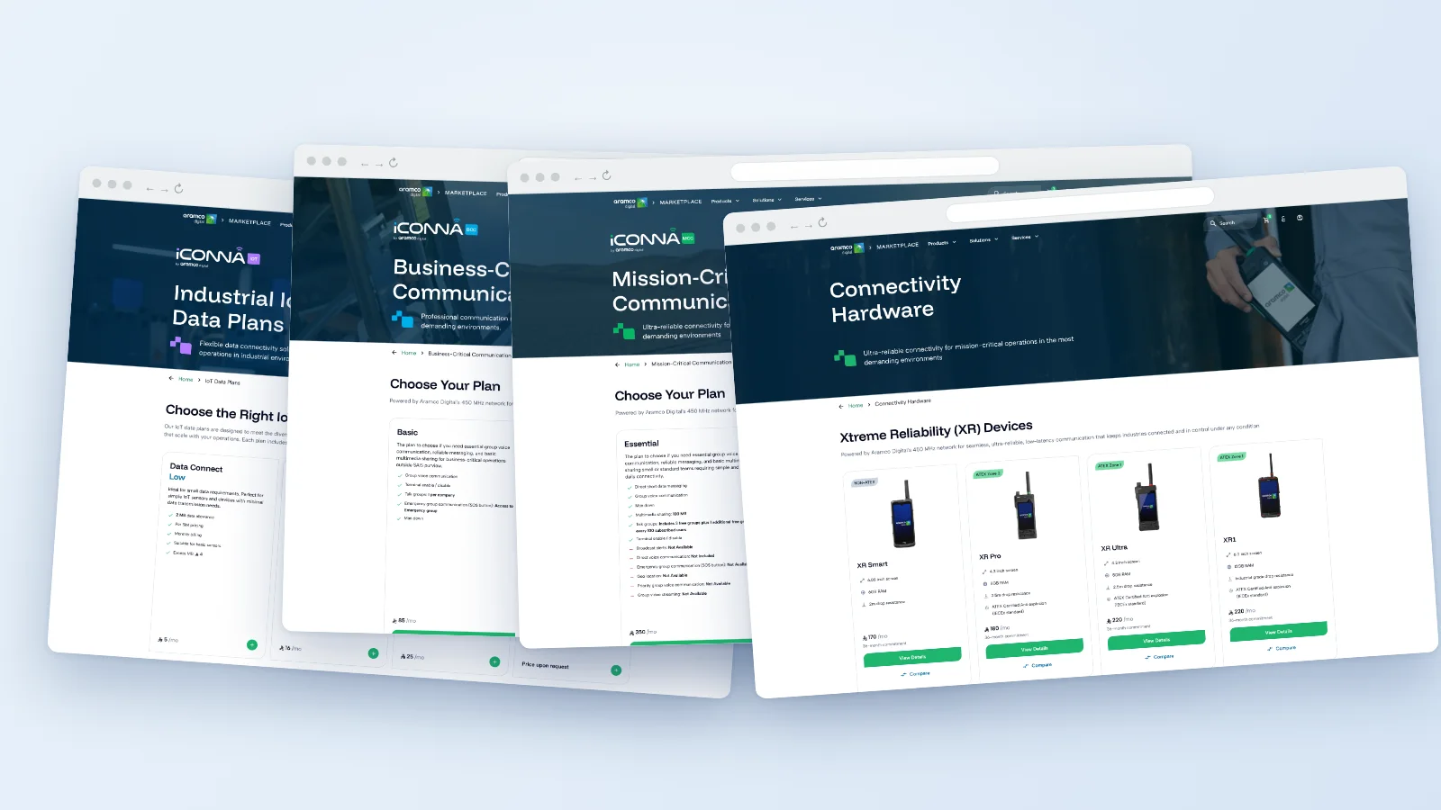
Customers could pick a plan and then add devices, or pick devices and then add a plan. The challenge was to keep the two paths consistent while still making them distinct.
I built the product detail cards and sections both paths use and helped rebuild the product and category pages around the updated components. The purchase screens also needed clearer add-on and accessory choices, consistent price labels, the updated brand guidelines, responsive layouts and Arabic right-to-left support.
A Decision I'd Make Again
Small details on a product card tell customers something. I replaced the single generic icon used for every device feature with icons specific to each feature, and made the price period exact where it varied, such as per month per device instead of per month. Both changes make the card tell customers what they're actually getting.